
How to Write a High Converting, Appealing Pricing Page For Your Site
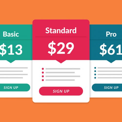
Creating a transparent pricing page was one of the best moves we did at my agency. We are (still) one of the only writing agencies in the industry that transparently discloses our rates and full pricing on one page. No hidden fees along the way for extras (editing, timelines, etc.). What you see is what you get. But when you go to put your pricing page together, it can be tricky. Imagine this… You’re creating your pricing page. You’ve got your price structure perfectly set up, and your page features tons of great information on why customers should jump on board. Finally, it’s time to go live and start converting some visitors! But then, crickets… Nobody’s converting. You’ve done everything the experts told you to do. You listed plenty of plan options. You highlighted your ‘most popular plan.’ You’ve got a FAQ section. You offered a free trial. Heck, you even put “money back guarantee” in big, bold letters at the top of the screen. So, what the heck is the problem? Why aren’t people converting? Grab a latte, coffee, or a tea and join me in today’s blog – all about how to create your high-converting pricing page! Why Isn’t My Pricing Page Converting? In her article about pricing page best practices, conversion expert Talia Wolf gives the perfect reasons why it’s not converting. As she mentions, your pricing page isn’t converting: Because you’re focusing on your product or service and not the outcome and bottom line for the customer Because you’re giving too many warnings to customers before they’ve even chosen a plan (i.e. ‘no questions asked!’ – ‘money back guarantee!’ – ‘no obligation!’) You see, when it comes to conversions, it’s all about helping the customer understand the positive outcome that they’re going to receive from purchasing your product or service. Anything that doesn’t do that is a distraction. And those distractions are preventing conversions. Takeaway: If you want to create a high converting pricing page, focus on communicating the outcome the customer is receiving and not on the actual action of signing up. The Elements of a High Converting Pricing Page: 3 of the Biggest Success Factors According to copywriting legend Eugene Schwartz, customers are always in one of five stages of awareness. They include: Image Source Now, when someone makes their way to your pricing page, they’re almost always going to be in either the solution aware, product aware, or most aware stage. So they don’t need to hear loads of information about features, how cheap your services are, and everything else that distracts from the outcome they’re seeking. A large percentage of pricing page visitors have already or are close to making a decision. The job of your pricing page, then, is to get them to take action and finalize that decision. That’s it. Nothing more, nothing less. But how exactly do you do it? Well, including the following elements will certainly help. 1. Keep It Simple An uncluttered, simple design helps ensure that the focus remains on the customer and the outcome they will receive. Pricing pages with loads of copy, buttons, and colors do nothing but distract customers. Take a look at this example of an old pricing page from Dyn: There’s just far too much going on here. And any customer is going to have a tough time figuring out which plan, if any, they should be choosing. Thankfully, the good people at Dyn realized their mistake and fixed it. Here’s a look at the much simpler pricing page that they use today: While their copy could definitely be more customer outcome focused, this is MUCH better than their previous page. Takeaway: Simplicity wins when it comes to pricing pages. Don’t overwhelm visitors with choices and copy. Keep it simple and focused on the outcome for the customer. 2. Help Visitors Choose the Right Plan If you’re like most companies, your pricing page features at least three plans. And while that’s fine, far too many pricing pages struggle to help visitors actually choose the plan that is right for them. Since you’re trying to get visitors to convert right away, that’s a problem. Take a look at this example from eVoice: As you can see, the plans have no names and provide zero guidance as to which one I should choose if I’m just getting started with this service. And, if I’m a small business, I still have a ton of questions about each plan that need to be answered before I decide to move forward. That puts me in a position where I either have to research more about each plan, contact support, or simply move on to another company that provides the same service. Now, take a look at this example from Viddler: If I’m a small business owner, I immediately know that the Business plan is the best fit. And while I’ll probably do more research before making a final decision, I’m already aware that I don’t even need to worry about the Pro or Enterprise plans. Create Plans Based on Your Buyer Personas As Price Intelligently CEO Patrick Campbell tells us: “Whether you’re pricing something as simple as a pencil or as complicated as a cloud storage platform, all pricing roads begin with the almighty buyer persona.” The biggest problem with most pricing pages isn’t the page itself, but the plans that are featured on it. Most companies create plans based on what they think their customers want. Instead, your plans should be based on what you know your customers want, using your buyer personas as guidelines. Salesforce is a company that nails this concept: Take a look at the differences between each plan. They understand that different target customers need different benefits. And they make sure to cater the features of their plans to the needs of each buyer persona. In the end, they’re helping visitors choose the right plan for them. If you need some assistance with creating your buyer personas, this guide on How to Develop a Target Persona is a … Read more