
Websites of 2014: 12 Great Designs and How They Work With Content
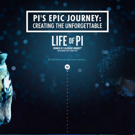
Image credit: Life of Pi movie website We’ve taken a look at how poor web content writing can destroy a well-made website but we didn’t explore the other side of it: the look and feel. Making sure that your content is fantastic is one thing, but creating a design to match can really elevate everything that’s being done to a whole new level. Without visual flair visitors will be hesitant to eat your fantastic meal that you’ve prepared for them because it looks like brown and gray sludge. It doesn’t matter how delicious it is. When you put it all together in a visually appealing way, and still keep the deliciousness, then no one hesitates to eat it and everyone tells their friends. Here are some of the top 12 sites to beat in no particular order. #12: Life of Pi This movie came out in 2012. We’ll admit that. But the site was ahead of its time. It is doing a lot of tricks that some designers are just now picking up. As you scroll down you get a little adventure the whole time, much of it in video. At some points, (again, you only have to scroll down to experience all of this seamlessly put together), you’ll see facts about the movie come onto the screen, allowing the content and design to come together in complete harmony. Essentially, you can look at the entire experience as an enhanced preview. In a time when most movie websites look barely better than what people were putting up themselves on GeoCities in the mid 90s it’s refreshing to see this kind of attention paid to marrying content and design. #11: Lexus We’ll tell you right now that one of the phrases that will be used a lot in this article is “parallax scrolling.” Parallax scrolling isn’t a new concept. Well, it seems to only be a new concept for website design. It’s been used in cartoons since you were a kid. See how confident we were in saying that? It doesn’t matter how old you are, it’s been used. It has even been used in video games for decades (Super Mario World had it). But now it’s come to website design fairly frequently. Lexus makes amazing use of it and allows users to essentially navigate an entire world of landing pages without loading anything or moving to another page at all. Even within the parallax scrolling body are smaller sections of the site that are independently interactive. For a good example of this, head to the site and go to the “Journey” section. While plenty of sites are using parallax scrolling by itself, Lexus is one of the few that is using it in tandem with already-established practices for even greater effect. #10: Blocklevel Most of our English-speaking readers won’t know this (unless they use Google Translate) but Blocklevel is a company that designs websites, Facebook games, and all kinds of other web-oriented things. But the specific content isn’t why we’re here, although you can tell that the content is hard-hitting and concise (it is). The design of the site draws inspiration from the flat design trend that’s been overtaking everything from Apple’s new iOS to indie video games (Thomas Was Alone) to smartphone applications (Taasky). It’s the exact opposite of parallax scrolling. There is no illusion of depth, just bold simplicity. It’s easy on the eyes, easy to navigate, and allows your content to be the star of the show by pulling your eye right toward it. They both do wonders for enhancing content but Blocklevel is one of the examples of flat design gone right. #9: Theory Design Sidebars used to be all the rage but they didn’t always work on every browser with every setting. Sometimes necessary content got cut off to the side like a bad photographer cutting off your heads in a holiday family photo. All that’s left is ugly Christmas sweaters. Nowadays it’s all about the header that scrolls down with you. This may not seem different at first but you lose the risk of having content roll off the side. It’s easier to position all of your content smack dab in the middle of the screen and there’s no problems with cutoff. In fact, that middle position brings your eyes, again, straight to the content rather than having two sections of text that, depending on the positioning, bring your eyes back and forth or even pull your eye to the blank space between the two pillars of text. #8: Realtii Have you noticed any similarities about any of these sites yet? That’s right; they’re all long scrolling websites. Most of their content is on one continuous page. Even if each of the sections are connected to a different web address, they are blended together so they are effectively one page. Most of the buttons, if the site even has them, cause the site to scroll down quickly rather than open a page. This reduces any load time and reduces wait time because your visitors aren’t clicking on things for design, they’re clicking on things for content. Easy design just grabs their attention and keeps them around. #7: Paper Tiger I’m going to ask you to please bring out your cell phones for this next one because “responsive design” is the name of the game for this site. When you go to the site on your PC it looks gorgeous. Some parallax design elements, some wonderful typography, easy-to-digest content. But when you open it up on your smartphone is when it gets really interesting. Without even having to direct you to m.papertiger.com you see a perfectly formatted site. The parallax scrolling and header have been eschewed for a fully functional, flat design that just brings you content with no frills and minimal loading time. The buttons are massive and bold, making them perfect for even the clumsiest of thumbs and easy to see when you’re walking around … Read more