write great content - Express Writers

Websites of 2014: 12 Great Designs and How They Work With Content

Websites of 2014: 12 Great Designs and How They Work With Content

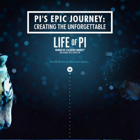
Image credit: Life of Pi movie website   We’ve taken a look at how poor web content writing can destroy a well-made website but we didn’t explore the other side of it: the look and feel. Making sure that your content is fantastic is one thing, but creating a design to match can really elevate everything that’s being done to a whole new level. Without visual flair visitors will be hesitant to eat your fantastic meal that you’ve prepared for them because it looks like brown and gray sludge. It doesn’t matter how delicious it is. When you put it all together in a visually appealing way, and still keep the deliciousness, then no one hesitates to eat it and everyone tells their friends. Here are some of the top 12 sites to beat in no particular order.   #12: Life of Pi This movie came out in 2012. We’ll admit that. But the site was ahead of its time. It is doing a lot of tricks that some designers are just now picking up. As you scroll down you get a little adventure the whole time, much of it in video. At some points, (again, you only have to scroll down to experience all of this seamlessly put together), you’ll see facts about the movie come onto the screen, allowing the content and design to come together in complete harmony. Essentially, you can look at the entire experience as an enhanced preview. In a time when most movie websites look barely better than what people were putting up themselves on GeoCities in the mid 90s it’s refreshing to see this kind of attention paid to marrying content and design.   #11: Lexus We’ll tell you right now that one of the phrases that will be used a lot in this article is “parallax scrolling.” Parallax scrolling isn’t a new concept. Well, it seems to only be a new concept for website design. It’s been used in cartoons since you were a kid. See how confident we were in saying that? It doesn’t matter how old you are, it’s been used. It has even been used in video games for decades (Super Mario World had it). But now it’s come to website design fairly frequently. Lexus makes amazing use of it and allows users to essentially navigate an entire world of landing pages without loading anything or moving to another page at all. Even within the parallax scrolling body are smaller sections of the site that are independently interactive. For a good example of this, head to the site and go to the “Journey” section. While plenty of sites are using parallax scrolling by itself, Lexus is one of the few that is using it in tandem with already-established practices for even greater effect.   #10: Blocklevel Most of our English-speaking readers won’t know this (unless they use Google Translate) but Blocklevel is a company that designs websites, Facebook games, and all kinds of other web-oriented things. But the specific content isn’t why we’re here, although you can tell that the content is hard-hitting and concise (it is). The design of the site draws inspiration from the flat design trend that’s been overtaking everything from Apple’s new iOS to indie video games (Thomas Was Alone) to smartphone applications (Taasky). It’s the exact opposite of parallax scrolling. There is no illusion of depth, just bold simplicity. It’s easy on the eyes, easy to navigate, and allows your content to be the star of the show by pulling your eye right toward it. They both do wonders for enhancing content but Blocklevel is one of the examples of flat design gone right.   #9: Theory Design Sidebars used to be all the rage but they didn’t always work on every browser with every setting. Sometimes necessary content got cut off to the side like a bad photographer cutting off your heads in a holiday family photo. All that’s left is ugly Christmas sweaters. Nowadays it’s all about the header that scrolls down with you. This may not seem different at first but you lose the risk of having content roll off the side. It’s easier to position all of your content smack dab in the middle of the screen and there’s no problems with cutoff. In fact, that middle position brings your eyes, again, straight to the content rather than having two sections of text that, depending on the positioning, bring your eyes back and forth or even pull your eye to the blank space between the two pillars of text.   #8: Realtii Have you noticed any similarities about any of these sites yet? That’s right; they’re all long scrolling websites. Most of their content is on one continuous page. Even if each of the sections are connected to a different web address, they are blended together so they are effectively one page. Most of the buttons, if the site even has them, cause the site to scroll down quickly rather than open a page. This reduces any load time and reduces wait time because your visitors aren’t clicking on things for design, they’re clicking on things for content. Easy design just grabs their attention and keeps them around.   #7: Paper Tiger I’m going to ask you to please bring out your cell phones for this next one because “responsive design” is the name of the game for this site. When you go to the site on your PC it looks gorgeous. Some parallax design elements, some wonderful typography, easy-to-digest content. But when you open it up on your smartphone is when it gets really interesting. Without even having to direct you to m.papertiger.com you see a perfectly formatted site. The parallax scrolling and header have been eschewed for a fully functional, flat design that just brings you content with no frills and minimal loading time. The buttons are massive and bold, making them perfect for even the clumsiest of thumbs and easy to see when you’re walking around … Read more

Copywriting & Playwriting: Secrets of Great Writing from the Big Screen

Copywriting & Playwriting: Secrets of Great Writing from the Big Screen

Were you ever in a play? Most of us have tried our hand at acting at some point in our life. For the majority of us, it was in elementary school. Some of us volunteered or auditioned for roles in middle and high school productions. The brave and bold out there, they went to college and took acting classes. Whether we found it fun or nerve wracking, most of us have been in a play at least once. According to SoYouWanna.com, every stage play has a beat. Actors learn about the beat early on in their careers, and they work with beats on every production they undertake. SoYouWanna.com says a beat is “that moment in a scene when something big happens, when stakes are raised, when characters confront their foes and win. Or lose… It’s a given that a play won’t crackle and keep audiences on their toes unless it has commanding beats.” Copywriting Secrets: What Play Beats Can Teach Copywriters Play beats are written by none other than writers who specialize in playwriting and scripts. Every theatrical production is composed of beats, whether it’s a Broadway play or a big Hollywood production. SoYouWanna.com goes on to reveal that a good beat is made up of five specific keys: Action Obstacle Event Stakes Strategies If you dabble in copywriting (or even creative writing), I’m willing to bet your brain is buzzing right now. Don’t these five keys sound just a little familiar? Obviously, they aren’t identical to the primary keys we follow when writing copy. Nonetheless, I’m willing to bet you’re drawing comparisons to the five keys of copywriting: Grab attention Overcome objections Present the benefits Tell them what they stand to lose (or gain) Issue a call to action As you can see, we have the potential to learn a lot from the “tricks” of playwriting and big screen script writing. But before we dive into the parallels and review a few vital secrets, let’s first talk about the biggest swaying point of films, plays, television and writing: the audience. The TV Audience versus Your Audience In regards to television, Steve Jobs said, “I think it’s brought the world a lot closer together, and will continue to do that. There are downsides to everything; there are unintended consequences to everything. The most corrosive piece of technology that I’ve ever seen is called television – but then again, television, at its best, is magnificent.” What makes a television program undeniably magnificent? Not everyone is a fan of Hallmark movie productions. You know what I’m talking about. Those Hallmark feature films, the ones that air on a special night on your local television station, usually right around a holiday. In fact, I know some guys who won’t hesitate to labels these feature films as “sappy chick flicks,” and they do everything in their power to get out of watching them with the girlfriend or wife. But when they fail to escape a Hallmark movie night, do you know what inevitably seems to happen? They’re usually caught quickly wiping away a tear at some point, pretending it never happened. Why? The program touched them. It reached them. They connected to it, and they felt something. They felt something so strong that it evoked a physical reaction. Successful television productions, the ones that stand out as award winning material, all have one rudimentary thing in common: they reach out and touch the audience. Successful copywriting projects, the ones that scream awesome and go viral, also have one rudimentary thing in common: they reach out, touch the audience and move them to action. The primary focus of both industries is the audience. Let’s face it, without the undivided attention and backing of the audience, every production would inevitably be a lost cause. Content is useless if no one wants to read it, just like a play, movie or television program isn’t worth production costs if no one wants to see it. The Secrets of Great Writing Steven Spielberg, unarguably one of the greatest movie directors of our time, once said, “It all starts with the script: it’s not worth taking myself away from my family if I don’t have something I’m really passionate about.” It’s amazing what passion can do. It reaches deep down into the depths of our core. It motivates us. It has the power to temper or amplify our reactions. It can be like jet fuel! So, what prodigious secrets does great writing from the big screen reveal? The first secret we can glean from the big screen is that if it lacks passion, it’s not worth doing. The first key to awesome copywriting is grabbing attention. How do we accomplish this? Like the playwriting beat, we start off with a little action. We infuse a little passion. We take our excitement and transform it into a hooking introduction that cascades down into the headings and paragraphs. The infusion of passion, a strong and basic emotion, is the perfect means of instantly establishing a connection with our all-important audience. It’s important to point out that just as a beat holds the audience’s attention throughout a theatrical production, the writing of copy needs to likewise hold attention. It can’t start out amazing and then vanish. The audience will vanish right along with it. Steven Spielberg offers another piece of advice that applies, “The public has an appetite for anything about imagination – anything that is as far away from reality as is creatively possible.” Now, the world of copywriting revolves around content that is usually educational, factual, informative and designed to promote a certain way of thinking or something for sale. How is Spielberg’s advice pertinent? A key means of holding the audience’s attention is through storytelling. Nine times out of ten, you’re relaying a true story, but the mere fact that it’s a narrative story connects the audience through the most motivating mental power known to man: imagination. Don’t underestimate this! The second secret is all about overcoming. For playwriting, … Read more